 Eau Sans Book, Bold, Black, Book Oblique, Bold Oblique, Black Oblique with proportional/old-styled/lining numerals download: OpenType | A3 poster |
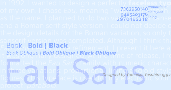 In 1992, I wanted to design a perfectly faceless typeface of my own. I chose Eau, meaning water in French, as the name. I planned to do two variations; a sanserif and a Roman serif style version. I could not decide on the design details for the Roman variation, so only the sanserif version was completed. Although I think that Eau Sans needs more refinement, I present it here as it was originally designed. At the time of release, I re-formatted the Eau Sans family with numeric characters in three variations: proportional, lining and old-styled figures. This typeface is used for my electronic sound project: parabola. A revised version Eau Douce Sans is available. Another variation Eau Naturelle Sans is also available. 完全に無個性的な書体を自分用に作ろうとしたのがきっかけで、フランス語で「水」を意味する名前を持つフォントEau (オウ) は1992年にデザインされた。サンセリフとローマン・セリフと2種類のヴァリエーションを考えていたが、結局ローマン・セリフの方はデザインのディティールが纏まらず、サンセリフであるEau Sansのみ完成した。今はEau Sansも微調整の必要を感じるが、作った当時のデザインのまま公開することにした。公開に当り、Eau Sansを数字のみ文字幅がそれぞれ違うもの、文字幅を揃えたもの (Lining) 、文字が古風なもの (Old-styled Figures) と3種類のヴァリエーションに分けた。 この書体は私のエレクトロニック・サウンド・プロジェクトであるparabolaに使われている。 改訂版のEau Douce Sansや、別ヴァージョンのEau Naturelle Sansもある。 Eau Sans is designed by Yamaoka Yasuhiro 1992. ©1992-2011 YOFonts/Yamaoka Yasuhiro. |