 Eau Douce Sans Thin, Light, Regular, Medium, Bold, Heavy with Old-styled Numerals download: OpenType | A3 poster |
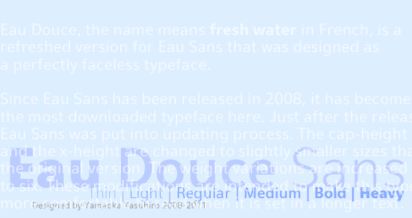 Eau Douce means fresh water in French. This is a revised version of Eau Sans that I designed as a perfectly generic typeface. Since Eau Sans was first debuted in 2008, it has become the most downloaded typeface from my website. Just after its release, I began the process of updating it. The cap-height and the x-height have been changed to slightly smaller sizes than in the original version. These modifications are intended to make this typeface easier to read when set in a longer text. The original version of Eau Sans is still available. Another variation Eau Naturelle Sans is also available. フランス語で「淡水」を意味する名前のEau Douce (オウ・ドゥース) は、完全に無個性的な書体としてデザインされたEau Sans (オウ・サンズ) の改訂版である。 Eau Sansを2008年に公開して以来、この書体は最もダウンロードされるものになった。公開直後にEau Sansは改訂作業が開始された。文字の大きさ (cap-height) と小文字の高さ (x-height) とが元のヴァージョンに比べて若干小さめに変更され、ウェイトのヴァリエーションも6種類に増やされた。この変更は、長めの文章をこの書体で組んだ時に、より読みやすくなるように考えられたものである。 元になったEau Sansは今でも入手可能。別ヴァージョンのEau Naturelle Sansもある。 Eau Douce Sans is designed by Yamaoka Yasuhiro 2008-2011. ©2011 YOFonts/Yamaoka Yasuhiro. |