 Eau Naturelle Sans Thin, Light, Regular, Medium, Bold, Heavy with Lining Numerals variations download: OpenType | A3 poster |
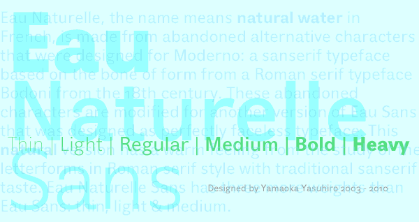 Eau Naturelle, the name means natural water in French, is made from abandoned alternative characters that were designed for Moderno: a sanserif typeface based on the bone of form from a Roman serif typeface Bodoni from the 18th century. These abandoned characters were modified for another version of Eau Sans that was designed as perfectly faceless typeface. This natural version has a warm feeling from the study of the letterforms in Roman serif style with traditional sanserif taste. Eau Naturelle Sans family has three more weights than Eau Sans: thin, light & medium. The italic complements are still on drawing. フランス語で「天然水」を意味する名前のEau Naturelle (オウ・ナチュレル) は、元々はModerno (モデルノ) という18世紀のローマン体Bodoniの文字の骨格に基づくサンセリフ書体用にデザインされたが採用されなかった字体のヴァリエーションから作られた。この不採用の字体は、完全に無個性的な書体としてデザインされたEau Sans (オウ・サンズ) の別ヴァージョンとして作り換えられた。この「天然」ヴァージョンには、ローマン体の字体の分析による暖かみに加え、伝統的なサンセリフ体の雰囲気もある。Eau Naturelle Sansファミリーのウェイトは、Eau Sansと違い、 更にThin、Light、Mediumの3つのウェイトが用意されている。イタリック体は現在準備中である。 Eau Naturelle Sans is designed by Yamaoka Yasuhiro 2003-2010. ©2011 YOFonts/Yamaoka Yasuhiro. |