 Conte Sans Light, Regular, Medium, Bold, Heavy, each with Italic and Alternate download: OpenType | A3 poster |
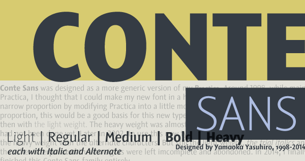 Conte Sans was designed as a more generic version of my Practica. Around 1998, while maintaining Practica, I thought that I could make my new font in a humanist sanserif category with a bit narrow proportion by modifying Practica into a little more rational look. Practica has narrow proportion, this would be a good basis for this new typeface. I began with the heavy weight, then with the light weight. The heavy weight was almost completed then, but the light weight had not been done yet. Later in 2002, to use this new typeface for my music project, I completed the heavy weight with the alternate characters. But still the light weight, the trial italics and the other interporated three weights were left imcomplete and abondoned. In 2014, I finally finished this Conte Sans family entirely. コンテ・サンズ (Conte Sans) は私のプラクティカ (Practica) をもう少し汎用性のあるものにしようとデザインされた。1998年頃プラクティカを修正している時に、その見た目を若干整理して、少し縦長のプロポーションのヒューマニスト・サンセリフ書体を新しく作れるのではないかと思ったのである。プラクティカは縦長のプロポーションなので、その良い基礎になりそうだった。まず最も太いウエイトから始め、次に最も細いウエイトに着手。その時、太い方はほぼ完成していたが、細い方はまだ仕上がっていなかった。その後2002年に私の音楽プロジェクト用に使用するため、太いウエイトを代替キャラクタと共に完成させたものの、細いウエイトやイタリックの試作、インターポレーションによって作成した他3つのウエイトは未完成のまま放置されていた。2014年に、最終的にコンテ・サンズ・ファミリーを全面的に完成させた。 Conte Sans was designed by Yamaoka Yasuhiro 1998-2014. ©2014 YOFonts/Yamaoka Yasuhiro. |